
Blog / February 2022
-
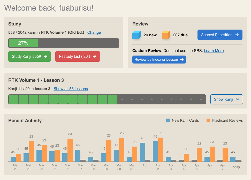
21 February 2022Progress Chart page redesign (Round 3 of new Dashboard prototype
Thanks to feedback from @francoisthire I've iterated yet again on the redesign for what is currently the "Progress Chart" page.
This updated design shows the state of Restudy cards in the progress bars directly, so that you can see the state of the cards in the SRS at a glance, just scrolling down the page - without having to go in the details of each lesson.
Expanding a lesson will give more fine-grained info such as the current SRS box (roughly, how well you know this card), the index range of the kanji in that lesson.
Once this is implemented you should be able also to navigate to the corresponding Study pages just by clicking the kanji cards (whether there is a flashcard or not).
Please check out the screenshot / mockup in this post and let me know what you think!
If you are interested it's still time to make suggestions in that thread - you'll need a simple free account on Github to post there - and I may iterate over some of those designs.
The next substantial update then will be what I call Milestone #1 which will be the top part of the new dashboard which you can see in this post. This will already be much, much better than the silly 3 green buttons that currently adorn the top of the homepage.
Onward!
-
7 February 2022New homepage dashboard prototypes - Round 2 !
Had a few rough weeks last month and didn't progress as much as I'd like... but I feel like the mockups for a new homepage are in sufficient detail for me to begin implementing!
Please check out the New Homepage Dashboard Prototypes - Round 2 discussion if you are interested,
This redesign aims to:
- improve the experience for first time users with a "Welcome" screen
- better guide users who are new to RTK and may not have the book yet, or didn't know enough about the site
- improve the flow when studying kanji, with the ability to pick up where you left yesterday
- provide a more detailed view of kanji in each lesson, as well as flashcards and their SRS status in these lessons
- provide a better sense of progression, right on the homepage
As with the previous thread, your feedback is welcome.
I spend about half the time just staring at the screen in FIGMA and running various scenarios in my mind , trying to think about different "states" the application can be in.
Something not obvious in the screenshots is that it;'s still possible to add new indexes, such as "RTK Lite" or even break down JLPT into lessons. All the logic is already in place, it's just there has been little discussion about it. However if I want to do that someday, the UI is ready to present lessons of any kanji sets, not just RTK (it already supports two indexes : RTK old and new edition).
Keep in mind I am not a graphic designer, and have no training in web design. I just enjoy UX a little bit. I am well aware that the screens are a bit bland and lack. Using bold color is really difficult. The Welcome screen for example should really "pop" more and be more colorful and visually distinct from the rest of the page.
So I could definitely take feedback and suggestions from anyone with skills in graphic design or UX. Here is a FIGMA file that contains mockups for the new homepage that anybody can edit and tweak. Send me a link to your edits and I'll have a look! just Keep in mind there may be a number of reasons why I can't implement X or Y or Z, however if I like something I'll definitely try to incorporate them.
I will begin implementing the new homepage in the coming weeks. To keep my sanity and motivation ;) I think I will break it down into smaller updates.
The Activity Log in particular can be a separate update, it's more or less standalone.
I think I will start with the top part. Even if I only ever implemented the top area, with the main RTK progress bar, it will still be 10 times better than currently, don't you think?
Next I will look at implementing the Lesson view with the expandable area with the kanji cards - as well as the new "Check Progress" page (now "View all lessons") since the new lessons page will use the same view.
The new Welcome page is a bit more annoying as I need to determine, and store a "state" for a new user. The user should be able to dismiss it and never see it again, yet it needs to be stored somehow.
By Month
- Apr 2024 (2)
- Mar 2024 (1)
- Feb 2024 (1)
- Dec 2023 (1)
- Nov 2023 (2)
- Oct 2023 (2)
- Apr 2023 (2)
- Mar 2023 (2)
- Feb 2023 (1)
- Jan 2023 (2)
- Dec 2022 (1)
- Nov 2022 (2)
- Oct 2022 (3)
- Sep 2022 (1)
- May 2022 (4)
- Apr 2022 (1)
- Feb 2022 (2)
- Jan 2022 (2)
- Dec 2021 (4)
- Nov 2021 (2)
- Oct 2021 (2)
- Sep 2021 (2)
- Aug 2021 (1)
- Apr 2021 (2)
- Feb 2021 (3)
- Jan 2021 (3)
- Dec 2020 (1)
- Nov 2020 (1)
- May 2020 (1)
- Apr 2020 (1)
- Jan 2020 (1)
- Oct 2019 (1)
- Sep 2019 (1)
- Aug 2019 (4)
- Jul 2019 (3)
- Jun 2019 (1)
- May 2019 (1)
- Mar 2019 (2)
- Jan 2019 (1)
- Nov 2018 (3)
- Oct 2018 (8)
- Sep 2018 (4)
- Aug 2018 (3)
- Jul 2018 (1)
- Jun 2018 (4)
- May 2018 (1)
- Apr 2018 (1)
- Mar 2018 (1)
- Jan 2018 (1)
- Dec 2017 (6)
- Nov 2017 (4)
- Oct 2017 (4)
- Sep 2017 (5)
- Aug 2017 (5)
- Jun 2017 (3)
- May 2017 (2)
- Apr 2017 (3)
- Mar 2017 (7)
- Feb 2017 (10)
- Jan 2017 (11)
- Dec 2016 (6)
- Nov 2016 (5)
- Oct 2016 (6)
- Sep 2016 (7)
- Aug 2016 (3)
- May 2016 (1)
- Mar 2016 (2)
- Jan 2016 (1)
- Dec 2015 (3)
- Nov 2015 (1)
- Oct 2015 (1)
- Sep 2015 (7)
- Jul 2015 (2)
- Jun 2015 (1)
- May 2015 (5)
- Apr 2015 (4)
- Mar 2015 (5)
- Feb 2015 (4)
- Jan 2015 (5)
- Dec 2014 (4)
- Nov 2014 (3)
- Oct 2014 (2)
- Jun 2014 (1)
- Apr 2014 (2)
- Mar 2014 (4)
- Feb 2014 (3)
- Jan 2014 (4)
- Dec 2013 (2)
- Oct 2013 (1)
- Sep 2013 (1)
- Jun 2013 (4)
- May 2013 (1)
- Mar 2013 (1)
- Jan 2013 (2)
- Oct 2012 (2)
- Aug 2012 (1)
- Jul 2012 (2)
- Jun 2012 (2)
- May 2012 (1)
- Mar 2012 (2)
- May 2011 (1)
- Apr 2011 (4)
- Mar 2011 (3)
- Feb 2011 (2)
- Jan 2011 (2)
- Dec 2010 (8)
- Nov 2010 (8)
- Oct 2010 (3)
- Sep 2010 (3)
- Aug 2010 (1)
- Jul 2010 (2)
- Jun 2010 (5)
- May 2010 (1)
- Apr 2010 (3)
- Mar 2010 (4)
- Feb 2010 (2)
- Jan 2010 (1)
- Dec 2009 (5)
- Nov 2009 (5)
- Oct 2009 (1)
- Aug 2009 (1)
- May 2009 (5)
- Apr 2009 (2)
- Mar 2009 (1)
- Feb 2009 (2)
- Jan 2009 (2)
- Nov 2008 (1)
- Oct 2008 (1)
- Sep 2008 (1)
- May 2008 (2)
- Apr 2008 (1)
- Feb 2008 (6)
- Jan 2008 (5)
- Dec 2007 (6)
- Oct 2007 (1)
- Sep 2007 (2)
- Aug 2007 (3)
- Jun 2007 (1)
- May 2007 (5)
- Apr 2007 (1)
- Mar 2007 (2)
- Feb 2007 (1)
- Jan 2007 (4)
- Dec 2006 (3)
- Aug 2006 (1)
- Jun 2006 (3)
- Apr 2006 (6)
- Mar 2006 (8)
- Feb 2006 (1)
- Jan 2006 (4)
- Nov 2005 (1)
- Oct 2005 (4)
- Sep 2005 (1)
- Aug 2005 (11)