What's up next in kanji land? I am working on refresh/redesign! Granted there are a lot of things I could work on, but one issue that always come up when I consider a new feature is "Where do I fit this in?".
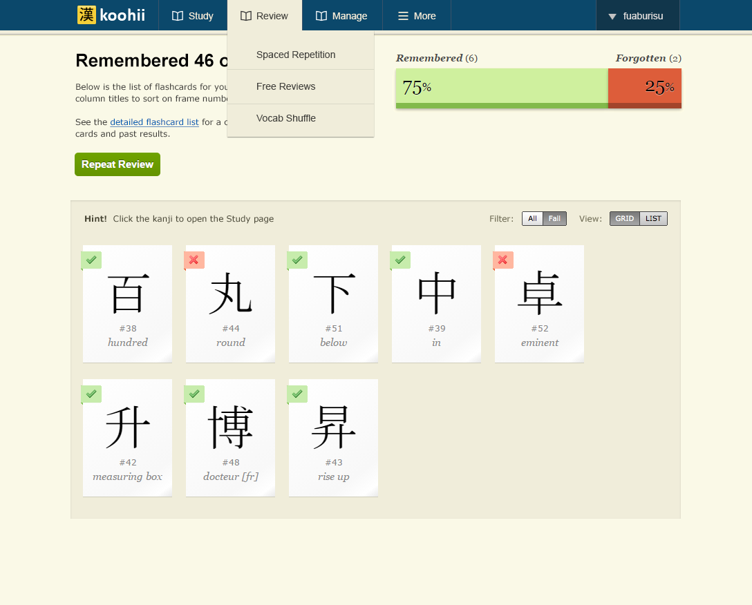
Here is a concept that illustrates a few things I'd like to introduce with a new design, and what I am trying to solve. Please note the icons, fonts and colours may still change, this is mostly to get a feel for what the layout will be like (click for fullsize image):
•
Responsive layout: I want to rethink the structure from the ground up, so that I have a consistent layout to use when adding new pages or sections to a page. The content will be elastic but a maximum width will be set for desktop so that it looks ok when maximizing the browser on wide screens.
•
"floaty layout": I want to remove the "boxed" design. The problem with boxes, is that they are often tricky to align. If you want for example to have 50/50 columns, the boxes often end up with different heights due to how HTML pages flow. It leaves empty spaces that look odd. The padding and spacing between boxes also add unnecessary space that makes it difficult to scale down properly. Using a plain background with no"boxed in content" is cleaner, and also easier to scale down to smaller screens.
•
Menus: this is a big change. Using drop down menus will make it much easier to add new pages. The idea here is to feature the most used pages in the navigation first, while the "More" tab with a "hamburger" icon features a drop down menu that can hold secondary content. Clicking Study or Review will go to the main page, but clicking a subpage in a dropdown can take you directly to sub-content (like the Detailed Flashcard List), without clicking through multiple pages. These menus will be
mobile friendly: they will also work with a single click/tap so they will work on mobile or tablet.
•
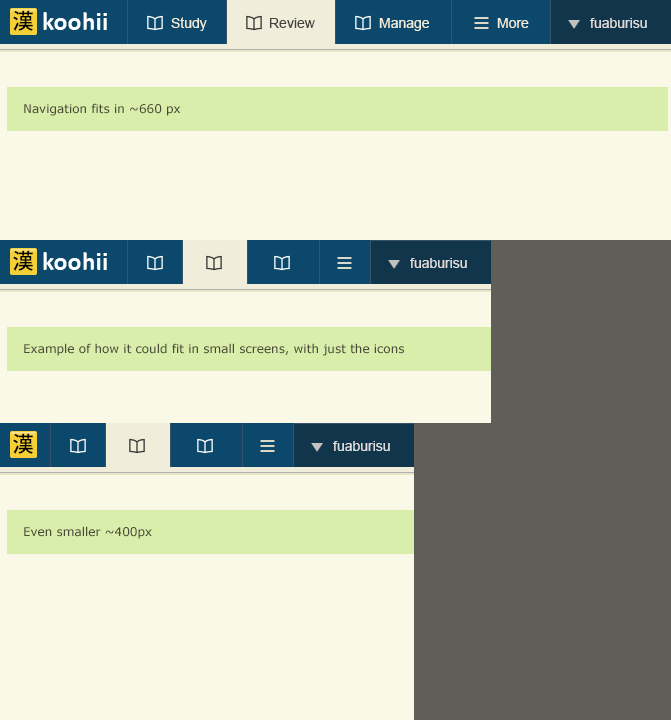
Mobile support: I can not remake all the content to fit on mobile phones, as that is a huge amount of work and it probably doesn't make that much sense to do everything on mobile anyway. With that said, the navigation is designed so that it can scale down to very small screens (screenshot below). As the resolution gets lower, we can hide the labels, and we can even hide the main "koohii" logo. The icons will be different, so the user can identify the main content.
Mobile friendly navigation (concept) (click for fullsize image)
That is quite a lot of work and I am currently planning how to make this into incremental updates. The first update will feature mostly identical pages, with a little bit of flexible content. It will probably not fit at all on mobile, but the new navigation and theme should be in place.