
Blog / January 2015
-
21 January 2015 The touch of apples
I finally added an apple touch icon to the website. It's not the most exciting icon I could think of.. but hey it is definitely better than the default one. To use the new icon on iOS or Android make sure to reload the page if it was already in Safari, and then use the "Add to Home Screen" feature.
From what I gather it should also work when adding a bookmark with the default Android browser, however I could not test. Please let me know if it works or not! -
16 January 2015 Update #2: hiding the most reported stories
Update 2 : The criteria for hiding stories was improved, taking in account the number of votes against the number of reports. Roughly half of the stories now that were hidden should no longer be hidden by default.
Update Please post feedback for this change in this forum thread.
Today the website is updated with an oft-requested feature: stories that have 10 reports or more as well as a low votes to report ratio, are hidden by default and can be shown with a small "Unhide" link.
I hope this improves the experience in the Study pages. It's one of these features that I had lying in an "experimental" branch and procrastinated on. Thanks to Jonathan for reminding me about it today! -
15 January 2015 Redesign (work in progress)
What's up next in kanji land? I am working on refresh/redesign! Granted there are a lot of things I could work on, but one issue that always come up when I consider a new feature is "Where do I fit this in?".
Here is a concept that illustrates a few things I'd like to introduce with a new design, and what I am trying to solve. Please note the icons, fonts and colours may still change, this is mostly to get a feel for what the layout will be like (click for fullsize image):• Responsive layout: I want to rethink the structure from the ground up, so that I have a consistent layout to use when adding new pages or sections to a page. The content will be elastic but a maximum width will be set for desktop so that it looks ok when maximizing the browser on wide screens.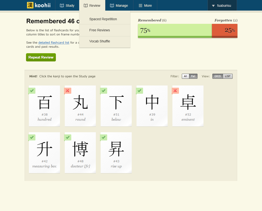
• "floaty layout": I want to remove the "boxed" design. The problem with boxes, is that they are often tricky to align. If you want for example to have 50/50 columns, the boxes often end up with different heights due to how HTML pages flow. It leaves empty spaces that look odd. The padding and spacing between boxes also add unnecessary space that makes it difficult to scale down properly. Using a plain background with no"boxed in content" is cleaner, and also easier to scale down to smaller screens.
• Menus: this is a big change. Using drop down menus will make it much easier to add new pages. The idea here is to feature the most used pages in the navigation first, while the "More" tab with a "hamburger" icon features a drop down menu that can hold secondary content. Clicking Study or Review will go to the main page, but clicking a subpage in a dropdown can take you directly to sub-content (like the Detailed Flashcard List), without clicking through multiple pages. These menus will be mobile friendly: they will also work with a single click/tap so they will work on mobile or tablet.
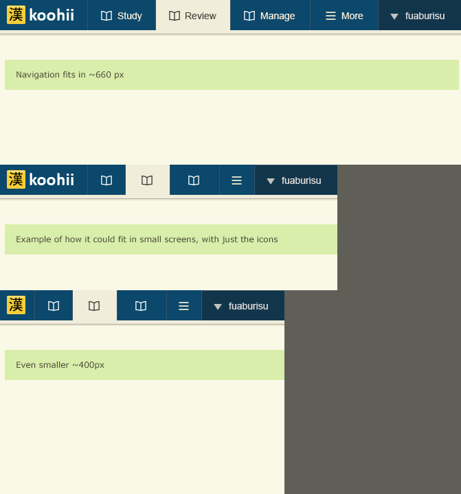
• Mobile support: I can not remake all the content to fit on mobile phones, as that is a huge amount of work and it probably doesn't make that much sense to do everything on mobile anyway. With that said, the navigation is designed so that it can scale down to very small screens (screenshot below). As the resolution gets lower, we can hide the labels, and we can even hide the main "koohii" logo. The icons will be different, so the user can identify the main content.
Mobile friendly navigation (concept) (click for fullsize image)
That is quite a lot of work and I am currently planning how to make this into incremental updates. The first update will feature mostly identical pages, with a little bit of flexible content. It will probably not fit at all on mobile, but the new navigation and theme should be in place.
-
5 January 2015 Flashcards galore!
You can now add flashcards, and customize the keyword, for all the CJK Unified Ideographs characters!
To add characters that are not part of Remember the Kanji (ie. they don't have a "frame number"), use Add Custom Flashcard Selection. For example try adding "spider" by copy/pasting 蜘 in the box.
Now if you go to the Detailed Flashcard List you will see that those characters have a frame number between 20000 and 40000 (roughly). Put simply when you see index numbers that are in the five digit range, these are the actual unicode number for the Chinese, Japanese and Korean (CJK) characters.
For bugs/suggestions
... please post in this forum thread, thanks!
For those learning Chinese
All the characters in Remembering Traditional Hanzi, as well as Remembering Simplified Hanzi are now supported on this website. It is also possible to import keywords for all these characters. If there is interest, I am sure someone will put up a simple list to copy/paste into the site to get you going with the RTH/RSH books. -
4 January 2015 Happy New Year & Upcoming changes!
The next significant update will remove the flashcard and custom keyword limits, so that you can add flashcards for characters not included in Remembering the Kanji !
More specifically I will be updating the database so that all characters in the "CJK Unified Ideograph" (U+4E00 to U+9FAF) are covered. That is ~20900 characters, covering chinese characters in addition to the ~12000 from KANJIDIC which the site supported until now.
You can see some of these characters such as 蜘 ("spider") already have shared stories. With the upcoming update you will be able to add them to your flashcards as well as edit the keyword!
Thank you!
Thanks to everyone who showed support in 2014 ! Last year was a bit of a low for me, but things are looking better! While I do not reply individually to each donation, I assure you they are very helpful and meaningful to me.
It seems I am gaining a little grit lately, and am really hoping to keep the ball rolling throughout this year. Something I'd love to do is completely refresh the site's design and layout so it is more flexible across devices, as well as add options to customize the flashcards. And if you can think of something else you'd really like to see on this site let me know!
By Month
- May 2026 (1)
- Apr 2026 (6)
- Mar 2026 (4)
- Jan 2026 (4)
- Dec 2025 (1)
- Mar 2025 (1)
- Nov 2024 (1)
- Sep 2024 (1)
- Jun 2024 (2)
- May 2024 (4)
- Apr 2024 (3)
- Mar 2024 (1)
- Feb 2024 (1)
- Dec 2023 (1)
- Nov 2023 (2)
- Oct 2023 (2)
- Apr 2023 (2)
- Mar 2023 (2)
- Feb 2023 (1)
- Jan 2023 (2)
- Dec 2022 (1)
- Nov 2022 (2)
- Oct 2022 (3)
- Sep 2022 (1)
- May 2022 (4)
- Apr 2022 (1)
- Feb 2022 (2)
- Jan 2022 (2)
- Dec 2021 (4)
- Nov 2021 (2)
- Oct 2021 (2)
- Sep 2021 (2)
- Aug 2021 (1)
- Apr 2021 (2)
- Feb 2021 (3)
- Jan 2021 (3)
- Dec 2020 (1)
- Nov 2020 (1)
- May 2020 (1)
- Apr 2020 (1)
- Jan 2020 (1)
- Oct 2019 (1)
- Sep 2019 (1)
- Aug 2019 (4)
- Jul 2019 (3)
- Jun 2019 (1)
- May 2019 (1)
- Mar 2019 (2)
- Jan 2019 (1)
- Nov 2018 (3)
- Oct 2018 (8)
- Sep 2018 (4)
- Aug 2018 (3)
- Jul 2018 (1)
- Jun 2018 (4)
- May 2018 (1)
- Apr 2018 (1)
- Mar 2018 (1)
- Jan 2018 (1)
- Dec 2017 (6)
- Nov 2017 (4)
- Oct 2017 (4)
- Sep 2017 (5)
- Aug 2017 (5)
- Jun 2017 (3)
- May 2017 (2)
- Apr 2017 (3)
- Mar 2017 (7)
- Feb 2017 (10)
- Jan 2017 (11)
- Dec 2016 (6)
- Nov 2016 (5)
- Oct 2016 (6)
- Sep 2016 (7)
- Aug 2016 (3)
- May 2016 (1)
- Mar 2016 (2)
- Jan 2016 (1)
- Dec 2015 (3)
- Nov 2015 (1)
- Oct 2015 (1)
- Sep 2015 (7)
- Jul 2015 (2)
- Jun 2015 (1)
- May 2015 (5)
- Apr 2015 (4)
- Mar 2015 (5)
- Feb 2015 (4)
- Jan 2015 (5)
- Dec 2014 (4)
- Nov 2014 (3)
- Oct 2014 (2)
- Jun 2014 (1)
- Apr 2014 (2)
- Mar 2014 (4)
- Feb 2014 (3)
- Jan 2014 (4)
- Dec 2013 (2)
- Oct 2013 (1)
- Sep 2013 (1)
- Jun 2013 (4)
- May 2013 (1)
- Mar 2013 (1)
- Jan 2013 (2)
- Oct 2012 (2)
- Aug 2012 (1)
- Jul 2012 (2)
- Jun 2012 (2)
- May 2012 (1)
- Mar 2012 (2)
- May 2011 (1)
- Apr 2011 (4)
- Mar 2011 (3)
- Feb 2011 (2)
- Jan 2011 (2)
- Dec 2010 (8)
- Nov 2010 (8)
- Oct 2010 (3)
- Sep 2010 (3)
- Aug 2010 (1)
- Jul 2010 (2)
- Jun 2010 (5)
- May 2010 (1)
- Apr 2010 (3)
- Mar 2010 (4)
- Feb 2010 (2)
- Jan 2010 (1)
- Dec 2009 (5)
- Nov 2009 (5)
- Oct 2009 (1)
- Aug 2009 (1)
- May 2009 (5)
- Apr 2009 (2)
- Mar 2009 (1)
- Feb 2009 (2)
- Jan 2009 (2)
- Nov 2008 (1)
- Oct 2008 (1)
- Sep 2008 (1)
- May 2008 (2)
- Apr 2008 (1)
- Feb 2008 (6)
- Jan 2008 (5)
- Dec 2007 (6)
- Oct 2007 (1)
- Sep 2007 (2)
- Aug 2007 (3)
- Jun 2007 (1)
- May 2007 (5)
- Apr 2007 (1)
- Mar 2007 (2)
- Feb 2007 (1)
- Jan 2007 (4)
- Dec 2006 (3)
- Aug 2006 (1)
- Jun 2006 (3)
- Apr 2006 (6)
- Mar 2006 (8)
- Feb 2006 (1)
- Jan 2006 (4)
- Nov 2005 (1)
- Oct 2005 (4)
- Sep 2005 (1)
- Aug 2005 (11)