-
8 February 2017 Update: My Stories layout & Fix for long keywords
Today's update fixes Issue #4 [mobile] Fix long keyword in Study > My Stories, plus various small tweaks:
Before and after on mobile:• First, long keywords (usually customized by the user, with Japanese characters) are fixed and show on multiple lines instead of being cut out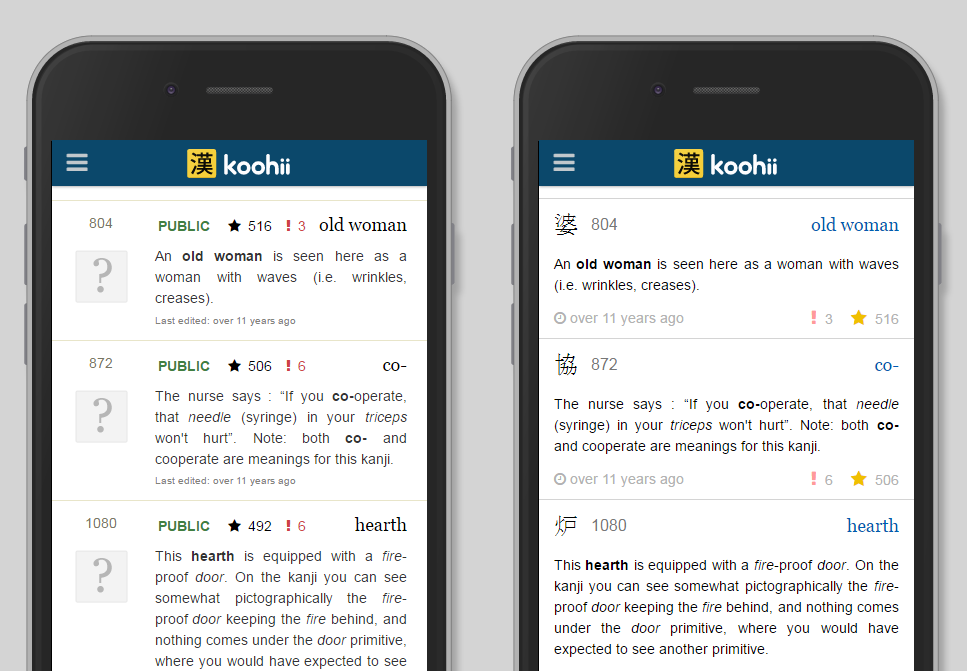
• Unified the layout of the stories with that of the Shared Stories in the Study pages. This is in preparation for refactoring those into a single VueJS component later (developer stuff). Which in turn will allow for better interactivity (like showing a +1 animation if you click star and the like, which is a huge pain to do with oldschool Javascript).
• The kanji is now always shown in My Stories list. Originally it was hidden and shown on "mouseover", but I think this was relatively of no use. This also simplifies mobile since mobile users don't have a "mouseover".
• Kanji is small and lined up with frame number on mobile, on desktop where there is more space and the stories can become too stretched horizontally, the kanji is larger and put to the side:
• Added title attribute (tooltip) for report / copy / vote buttons
• Added some :hover states (stars are yellow) (partially addresses issue #49
• Made the keyword only as a link to the Study page, instead of the entire story block. I thought this would be less annoying on mobile, where if you try to tap and scroll, you might open the Study page by mistake.
For bugs and suggestions comment on Github issues with a simple Github account. Issues I'm working on next are labelled "NEXT".
By Month
- May 2026 (1)
- Apr 2026 (6)
- Mar 2026 (4)
- Jan 2026 (4)
- Dec 2025 (1)
- Mar 2025 (1)
- Nov 2024 (1)
- Sep 2024 (1)
- Jun 2024 (2)
- May 2024 (4)
- Apr 2024 (3)
- Mar 2024 (1)
- Feb 2024 (1)
- Dec 2023 (1)
- Nov 2023 (2)
- Oct 2023 (2)
- Apr 2023 (2)
- Mar 2023 (2)
- Feb 2023 (1)
- Jan 2023 (2)
- Dec 2022 (1)
- Nov 2022 (2)
- Oct 2022 (3)
- Sep 2022 (1)
- May 2022 (4)
- Apr 2022 (1)
- Feb 2022 (2)
- Jan 2022 (2)
- Dec 2021 (4)
- Nov 2021 (2)
- Oct 2021 (2)
- Sep 2021 (2)
- Aug 2021 (1)
- Apr 2021 (2)
- Feb 2021 (3)
- Jan 2021 (3)
- Dec 2020 (1)
- Nov 2020 (1)
- May 2020 (1)
- Apr 2020 (1)
- Jan 2020 (1)
- Oct 2019 (1)
- Sep 2019 (1)
- Aug 2019 (4)
- Jul 2019 (3)
- Jun 2019 (1)
- May 2019 (1)
- Mar 2019 (2)
- Jan 2019 (1)
- Nov 2018 (3)
- Oct 2018 (8)
- Sep 2018 (4)
- Aug 2018 (3)
- Jul 2018 (1)
- Jun 2018 (4)
- May 2018 (1)
- Apr 2018 (1)
- Mar 2018 (1)
- Jan 2018 (1)
- Dec 2017 (6)
- Nov 2017 (4)
- Oct 2017 (4)
- Sep 2017 (5)
- Aug 2017 (5)
- Jun 2017 (3)
- May 2017 (2)
- Apr 2017 (3)
- Mar 2017 (7)
- Feb 2017 (10)
- Jan 2017 (11)
- Dec 2016 (6)
- Nov 2016 (5)
- Oct 2016 (6)
- Sep 2016 (7)
- Aug 2016 (3)
- May 2016 (1)
- Mar 2016 (2)
- Jan 2016 (1)
- Dec 2015 (3)
- Nov 2015 (1)
- Oct 2015 (1)
- Sep 2015 (7)
- Jul 2015 (2)
- Jun 2015 (1)
- May 2015 (5)
- Apr 2015 (4)
- Mar 2015 (5)
- Feb 2015 (4)
- Jan 2015 (5)
- Dec 2014 (4)
- Nov 2014 (3)
- Oct 2014 (2)
- Jun 2014 (1)
- Apr 2014 (2)
- Mar 2014 (4)
- Feb 2014 (3)
- Jan 2014 (4)
- Dec 2013 (2)
- Oct 2013 (1)
- Sep 2013 (1)
- Jun 2013 (4)
- May 2013 (1)
- Mar 2013 (1)
- Jan 2013 (2)
- Oct 2012 (2)
- Aug 2012 (1)
- Jul 2012 (2)
- Jun 2012 (2)
- May 2012 (1)
- Mar 2012 (2)
- May 2011 (1)
- Apr 2011 (4)
- Mar 2011 (3)
- Feb 2011 (2)
- Jan 2011 (2)
- Dec 2010 (8)
- Nov 2010 (8)
- Oct 2010 (3)
- Sep 2010 (3)
- Aug 2010 (1)
- Jul 2010 (2)
- Jun 2010 (5)
- May 2010 (1)
- Apr 2010 (3)
- Mar 2010 (4)
- Feb 2010 (2)
- Jan 2010 (1)
- Dec 2009 (5)
- Nov 2009 (5)
- Oct 2009 (1)
- Aug 2009 (1)
- May 2009 (5)
- Apr 2009 (2)
- Mar 2009 (1)
- Feb 2009 (2)
- Jan 2009 (2)
- Nov 2008 (1)
- Oct 2008 (1)
- Sep 2008 (1)
- May 2008 (2)
- Apr 2008 (1)
- Feb 2008 (6)
- Jan 2008 (5)
- Dec 2007 (6)
- Oct 2007 (1)
- Sep 2007 (2)
- Aug 2007 (3)
- Jun 2007 (1)
- May 2007 (5)
- Apr 2007 (1)
- Mar 2007 (2)
- Feb 2007 (1)
- Jan 2007 (4)
- Dec 2006 (3)
- Aug 2006 (1)
- Jun 2006 (3)
- Apr 2006 (6)
- Mar 2006 (8)
- Feb 2006 (1)
- Jan 2006 (4)
- Nov 2005 (1)
- Oct 2005 (4)
- Sep 2005 (1)
- Aug 2005 (11)