-
17 January 2022 Prototypes for a better homepage dashboard !
The homepage is long overdue for an update!
I've decided to reorder my todo list, and make it a priority for the next update(s) to improve the homepage dashboard so it is more useful as well as a less confusing experience for new users.
Last week I spent time mostly in Figma. It was productive and although the new design is relatively simple, I feel like the major elements are in place, and I'm eager to start implementing!
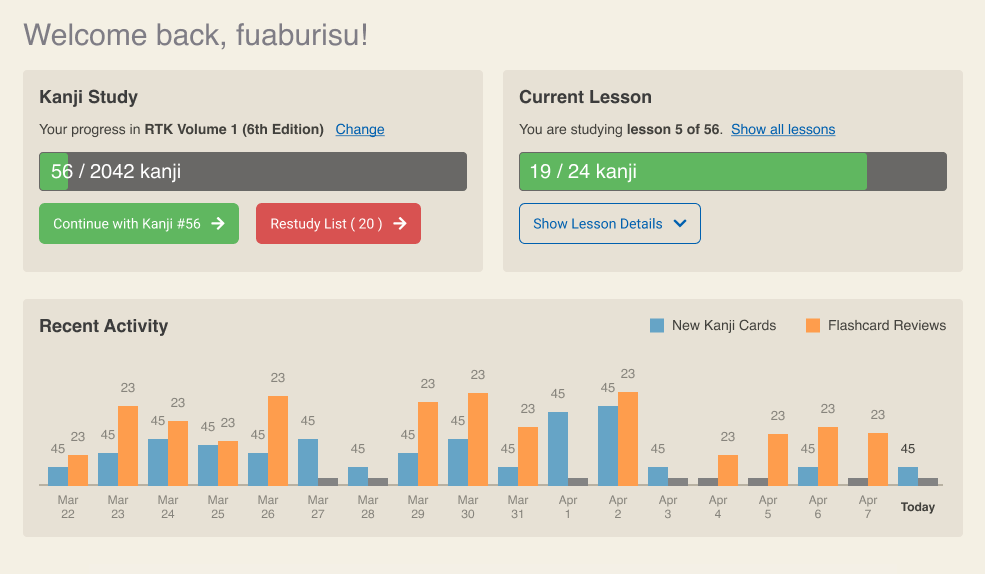
It's really hard for me to work on just "wireframes" (ie. just boxes and lines), so the prototype has colour and is relatively close to what I am going for. But also please keep in mind it is not finished -- it's a bit bland visually, and there is plenty of room to iterate in following updates.
Please check out the New homepage dashboard prototype discussion.
In this thread I go more in depth about what we are trying to solve, and how the new design would improve the user experience.
Now is a great time if you'd like to be able to give your input, and let me know what you think. Have I covered most user's needs with this new dashboard? Did you imagine something else? Any input is welcome and I may tweak the implementation accordingly.
By Month
- May 2026 (1)
- Apr 2026 (6)
- Mar 2026 (4)
- Jan 2026 (4)
- Dec 2025 (1)
- Mar 2025 (1)
- Nov 2024 (1)
- Sep 2024 (1)
- Jun 2024 (2)
- May 2024 (4)
- Apr 2024 (3)
- Mar 2024 (1)
- Feb 2024 (1)
- Dec 2023 (1)
- Nov 2023 (2)
- Oct 2023 (2)
- Apr 2023 (2)
- Mar 2023 (2)
- Feb 2023 (1)
- Jan 2023 (2)
- Dec 2022 (1)
- Nov 2022 (2)
- Oct 2022 (3)
- Sep 2022 (1)
- May 2022 (4)
- Apr 2022 (1)
- Feb 2022 (2)
- Jan 2022 (2)
- Dec 2021 (4)
- Nov 2021 (2)
- Oct 2021 (2)
- Sep 2021 (2)
- Aug 2021 (1)
- Apr 2021 (2)
- Feb 2021 (3)
- Jan 2021 (3)
- Dec 2020 (1)
- Nov 2020 (1)
- May 2020 (1)
- Apr 2020 (1)
- Jan 2020 (1)
- Oct 2019 (1)
- Sep 2019 (1)
- Aug 2019 (4)
- Jul 2019 (3)
- Jun 2019 (1)
- May 2019 (1)
- Mar 2019 (2)
- Jan 2019 (1)
- Nov 2018 (3)
- Oct 2018 (8)
- Sep 2018 (4)
- Aug 2018 (3)
- Jul 2018 (1)
- Jun 2018 (4)
- May 2018 (1)
- Apr 2018 (1)
- Mar 2018 (1)
- Jan 2018 (1)
- Dec 2017 (6)
- Nov 2017 (4)
- Oct 2017 (4)
- Sep 2017 (5)
- Aug 2017 (5)
- Jun 2017 (3)
- May 2017 (2)
- Apr 2017 (3)
- Mar 2017 (7)
- Feb 2017 (10)
- Jan 2017 (11)
- Dec 2016 (6)
- Nov 2016 (5)
- Oct 2016 (6)
- Sep 2016 (7)
- Aug 2016 (3)
- May 2016 (1)
- Mar 2016 (2)
- Jan 2016 (1)
- Dec 2015 (3)
- Nov 2015 (1)
- Oct 2015 (1)
- Sep 2015 (7)
- Jul 2015 (2)
- Jun 2015 (1)
- May 2015 (5)
- Apr 2015 (4)
- Mar 2015 (5)
- Feb 2015 (4)
- Jan 2015 (5)
- Dec 2014 (4)
- Nov 2014 (3)
- Oct 2014 (2)
- Jun 2014 (1)
- Apr 2014 (2)
- Mar 2014 (4)
- Feb 2014 (3)
- Jan 2014 (4)
- Dec 2013 (2)
- Oct 2013 (1)
- Sep 2013 (1)
- Jun 2013 (4)
- May 2013 (1)
- Mar 2013 (1)
- Jan 2013 (2)
- Oct 2012 (2)
- Aug 2012 (1)
- Jul 2012 (2)
- Jun 2012 (2)
- May 2012 (1)
- Mar 2012 (2)
- May 2011 (1)
- Apr 2011 (4)
- Mar 2011 (3)
- Feb 2011 (2)
- Jan 2011 (2)
- Dec 2010 (8)
- Nov 2010 (8)
- Oct 2010 (3)
- Sep 2010 (3)
- Aug 2010 (1)
- Jul 2010 (2)
- Jun 2010 (5)
- May 2010 (1)
- Apr 2010 (3)
- Mar 2010 (4)
- Feb 2010 (2)
- Jan 2010 (1)
- Dec 2009 (5)
- Nov 2009 (5)
- Oct 2009 (1)
- Aug 2009 (1)
- May 2009 (5)
- Apr 2009 (2)
- Mar 2009 (1)
- Feb 2009 (2)
- Jan 2009 (2)
- Nov 2008 (1)
- Oct 2008 (1)
- Sep 2008 (1)
- May 2008 (2)
- Apr 2008 (1)
- Feb 2008 (6)
- Jan 2008 (5)
- Dec 2007 (6)
- Oct 2007 (1)
- Sep 2007 (2)
- Aug 2007 (3)
- Jun 2007 (1)
- May 2007 (5)
- Apr 2007 (1)
- Mar 2007 (2)
- Feb 2007 (1)
- Jan 2007 (4)
- Dec 2006 (3)
- Aug 2006 (1)
- Jun 2006 (3)
- Apr 2006 (6)
- Mar 2006 (8)
- Feb 2006 (1)
- Jan 2006 (4)
- Nov 2005 (1)
- Oct 2005 (4)
- Sep 2005 (1)
- Aug 2005 (11)